BLESSET BUTCHERS
Blesset Butchers is a small family owned traditional butchers business with a rich heritage.
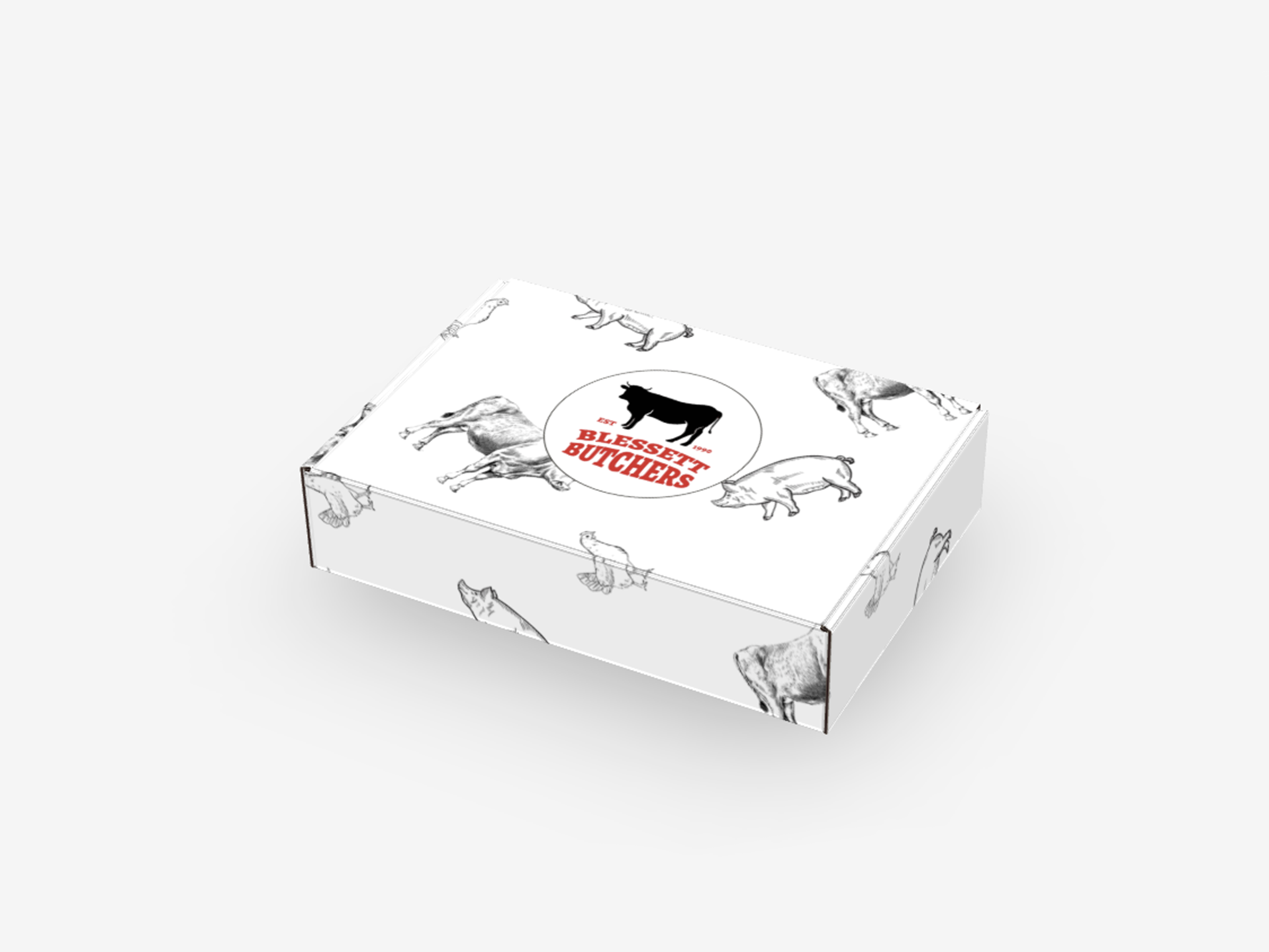
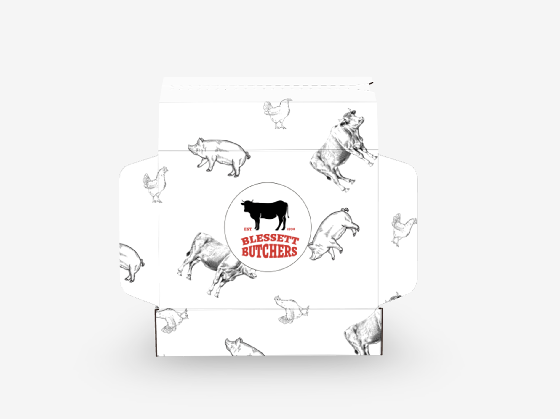
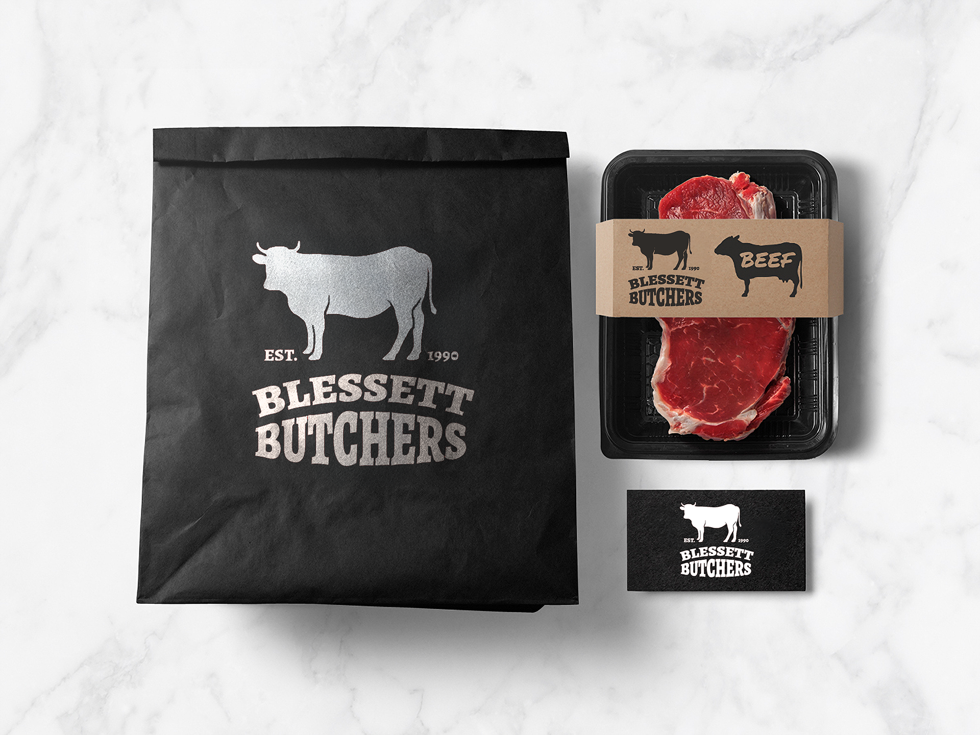
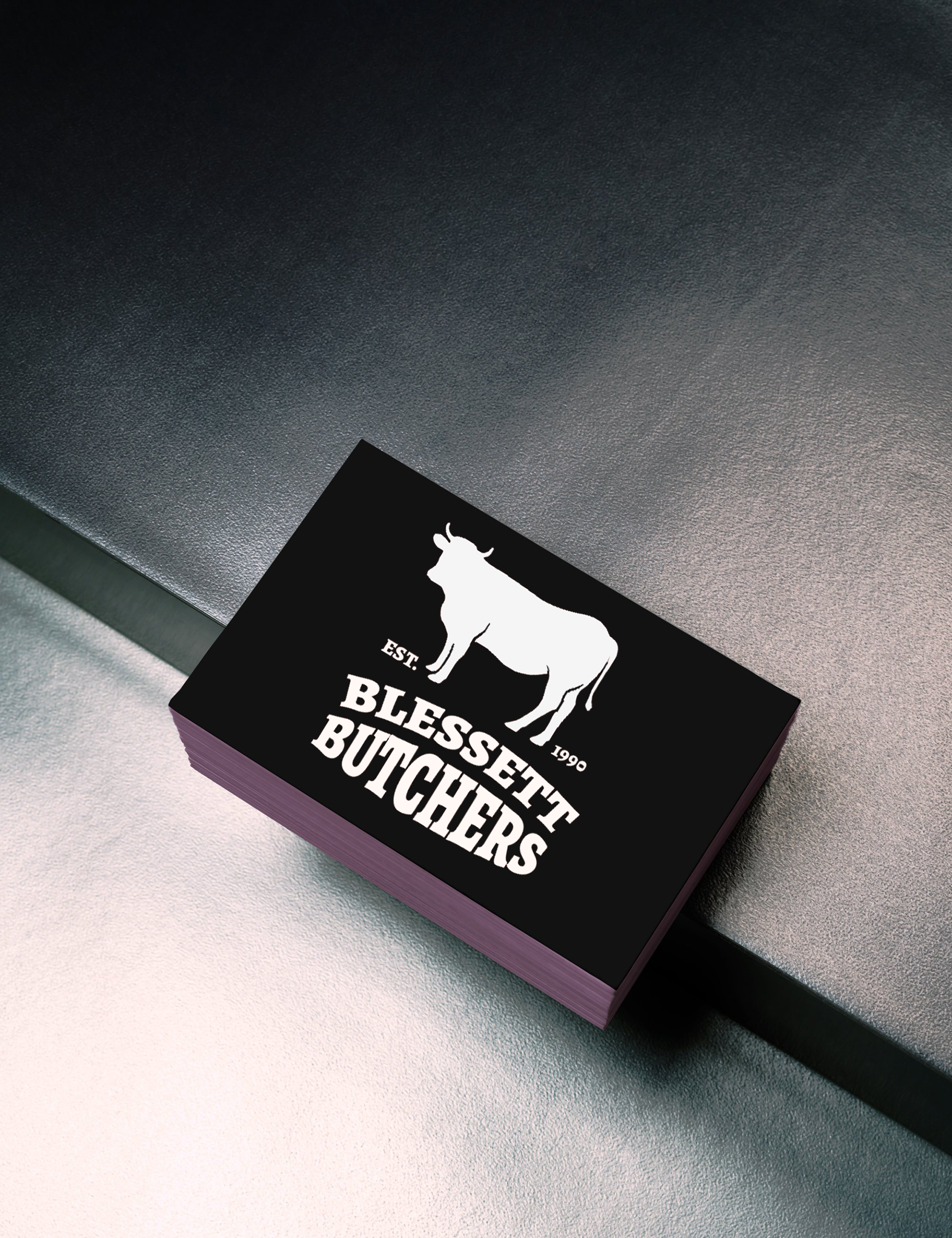
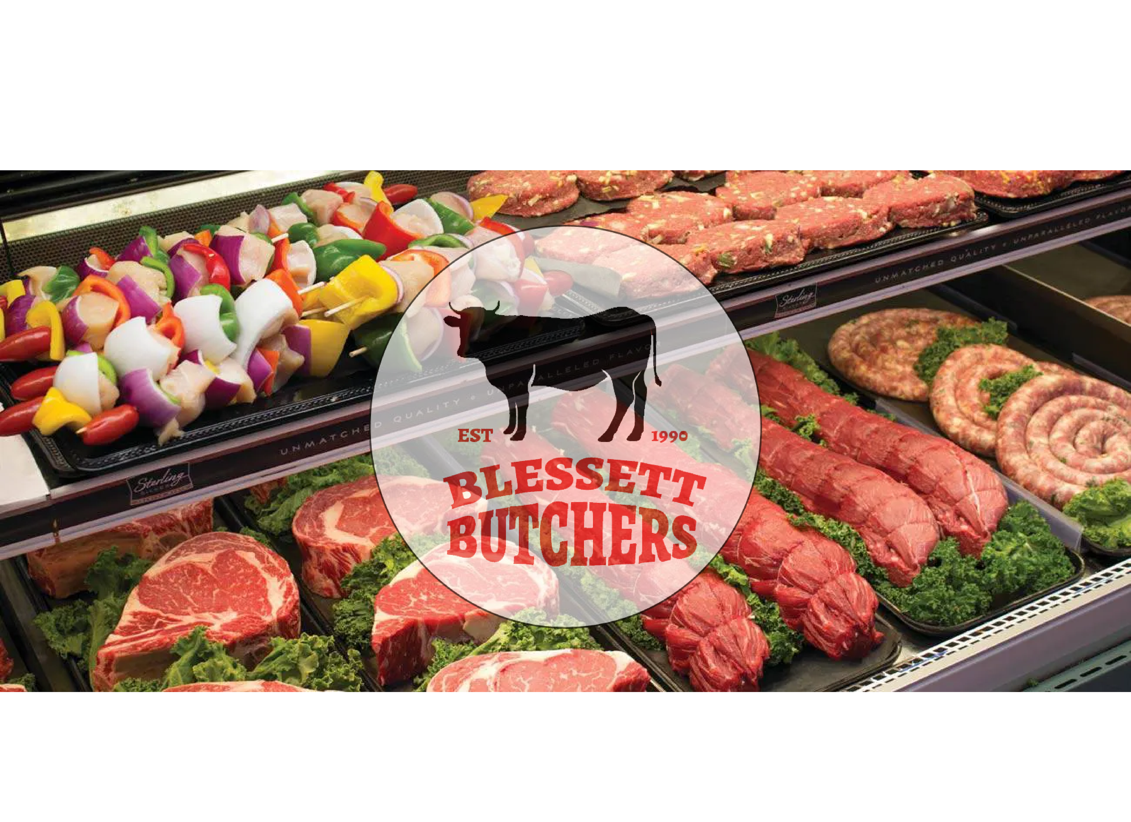
I worked with the client and led the re-design for their logo and some of their physical assets. They felt their existing designs were outdated and no longer reflected the quality and craftsmanship they’re known for.
Project Objectives:
Visual Identity / Packaging / Logo Design/ Modernise
The goal was to create something timeless yet fresh—capturing the essence of their traditional roots while appealing to a contemporary audience.
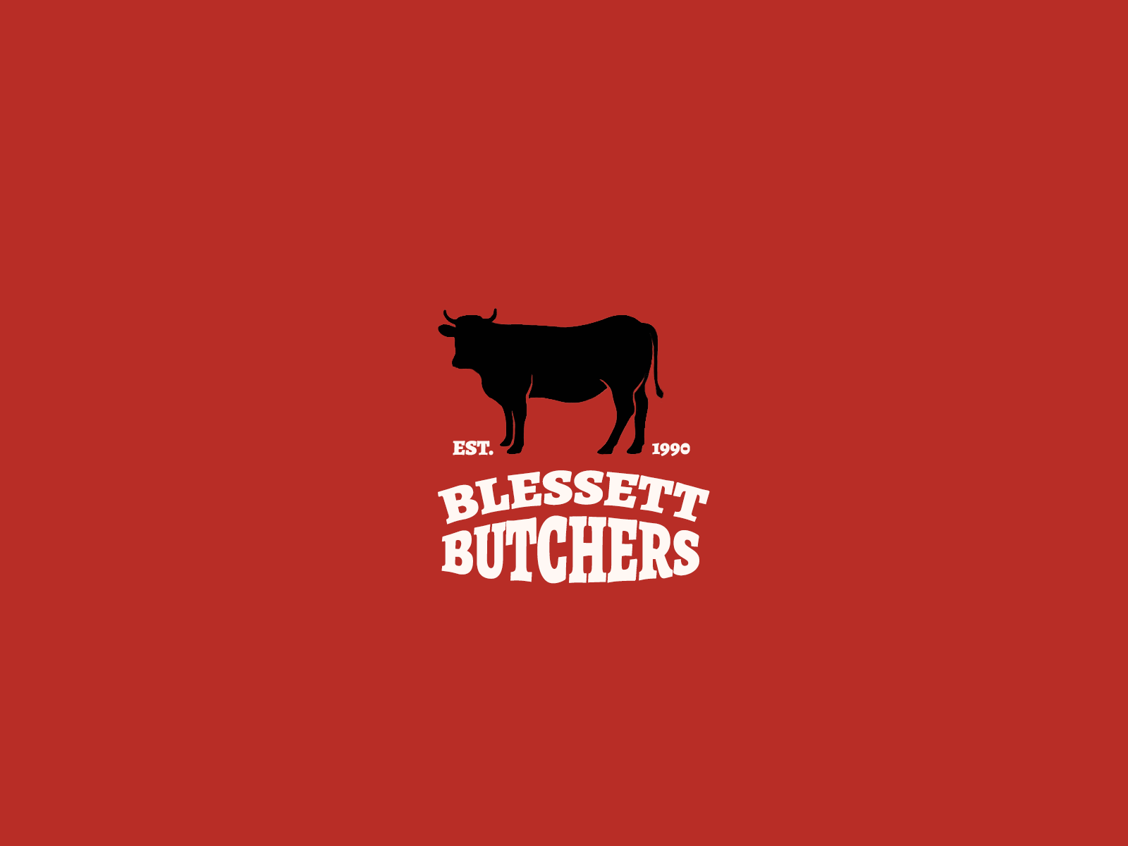
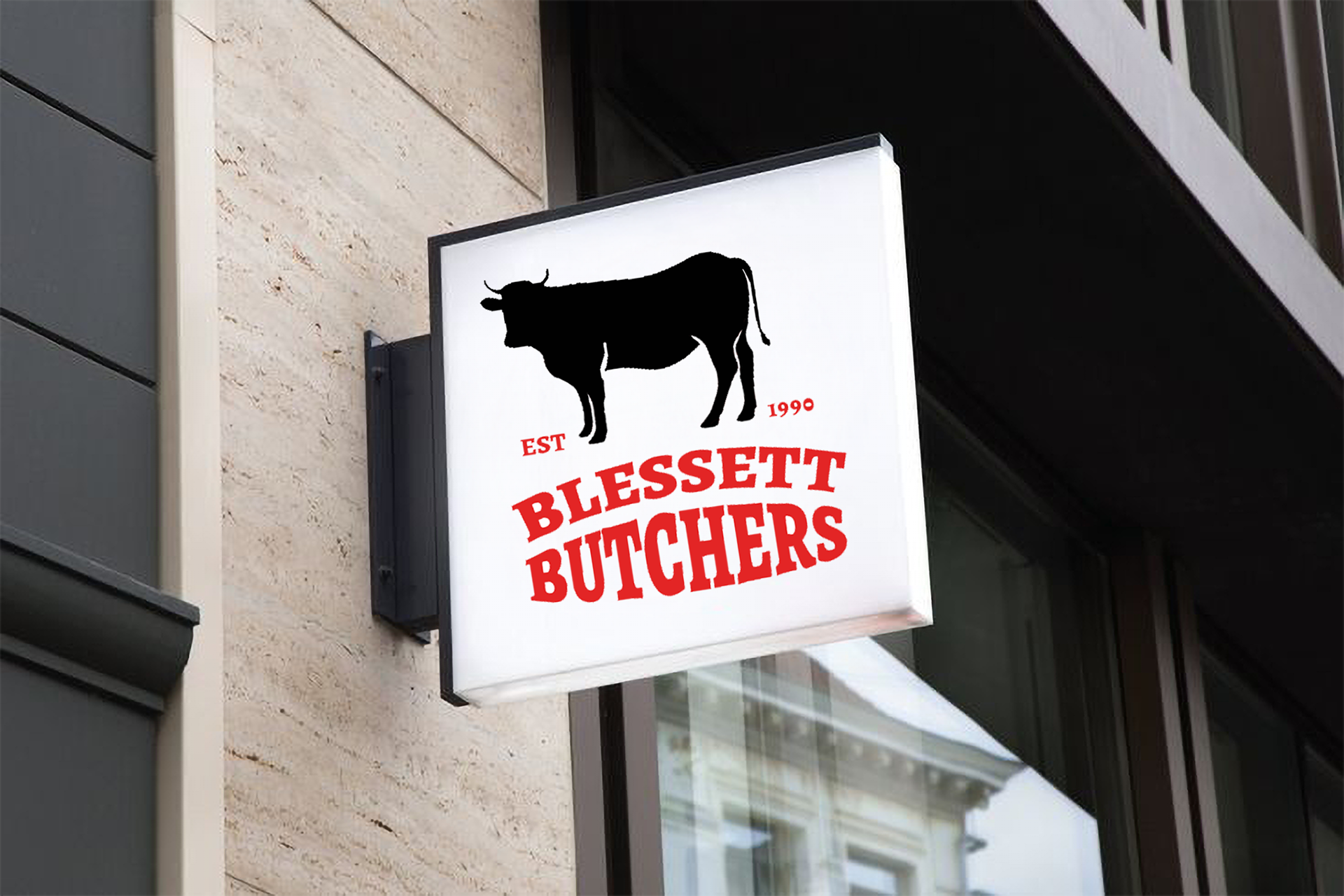
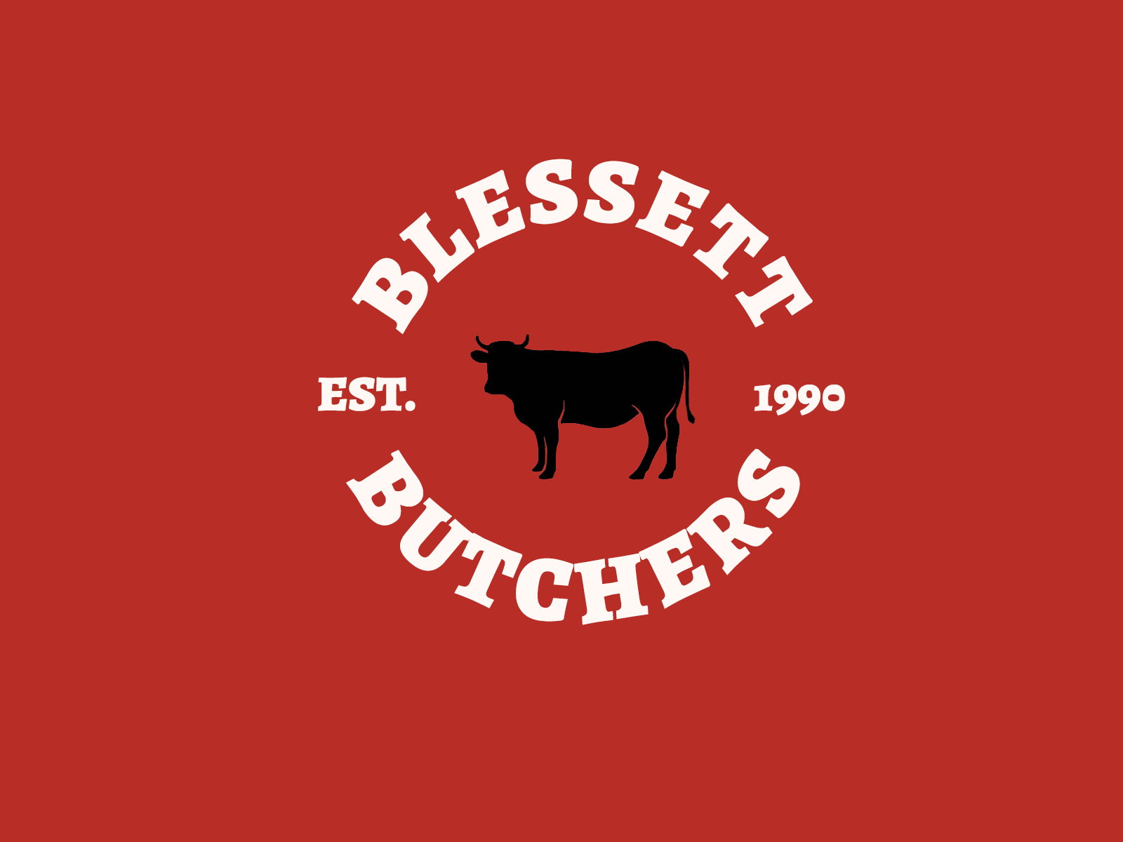
Logo Dark
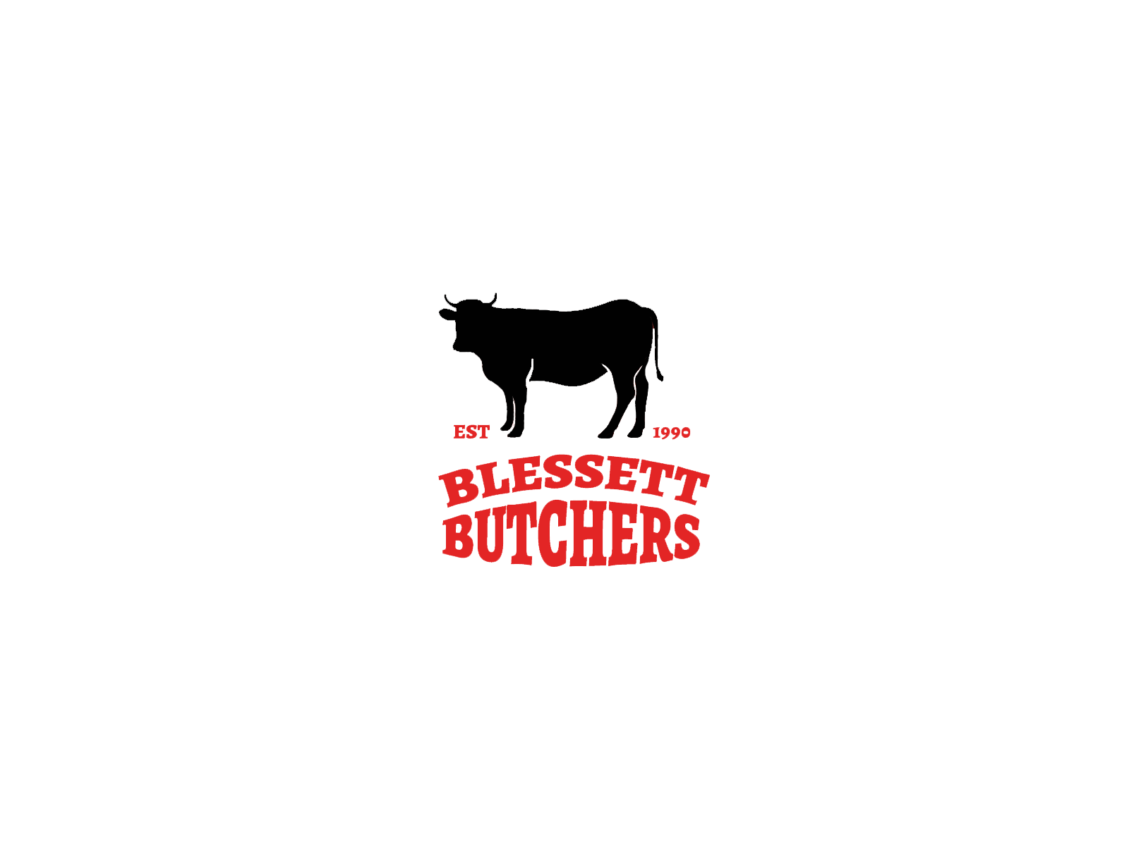
Logo Light

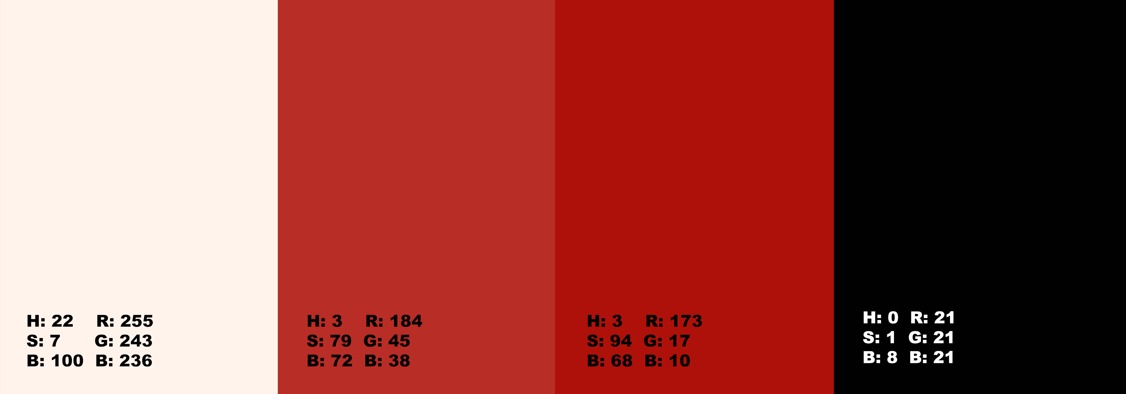
Blessett Butchers had previously utilised a limited selection of colours for their company, but without an official colour palette or comprehensive branding package. They expressed a desire to retain the reddish tone they were already using, though their font colour was solely black. I opted to use a shade of red that closely resembles the colour of fresh meat, which felt fitting for a butcher shop and aligned with their existing branding. Additionally, I incorporated an off-white hue, evoking the colour of bone, to maintain consistency with the traditional theme they wanted to uphold.
For typography, I selected Alegreya Black, as its bold, structured form evokes the shape of bones, complementing the off-white colour chosen for part of the branding. The typeface's modern design, with its distinct letterforms, introduces a contemporary touch, aligning with the goal of refreshing the brand’s identity.
This combination of colours and typography strikes a balance between modernising the company’s visual presence and retaining its traditional roots, ensuring the branding reflects both its heritage and future direction.

To address the issue of their outdated logo, I focused on creating concepts with a more minimalist approach for a sleeker design, while ensuring it stayed within their comfort zone.
I experimented with various typography styles to enhance the text's visual appeal. By combining this with a minimalist image, the overall design achieved a modern and streamlined look.
After liaising with the client, they shared that while they weren’t fond of the text wrapping around, they really liked the font and the overall concept I had presented. This led me to creating the second logo on the right which the client decided to proceed with.
Outcome:
From logo design, typography and colour palette to the physical assets of the company, I was able to create a cohesive and authentic brand presence that feels both modern and familiar, helping Blessett Butchers connect with customers in a more impactful way.